Play with Type
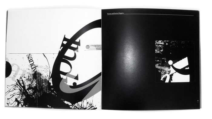
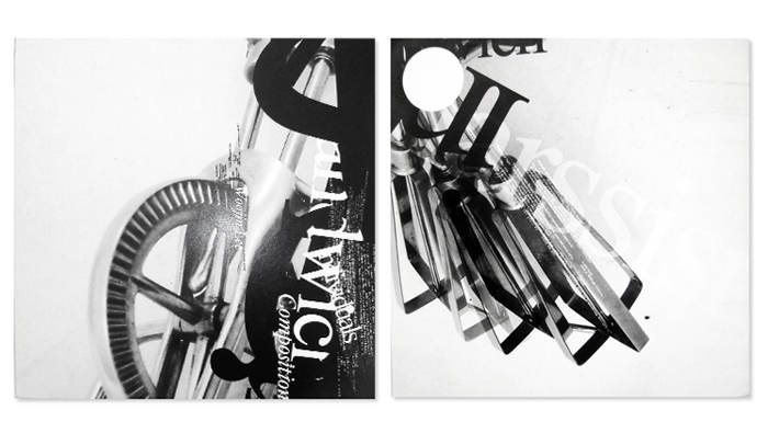
This composition is the incorporation of an image. With the same three levels of typography--letters, words and text--an image of a simple object was introduced to the mix. Texture could now be a part of the image, or continue as a separate element. Positive/negative, graphic elements and structure could be incorporated as needed. The resulting compositions are still abstract, but hint at the richness that can be incorporated into even the simplest realistic project. The complex relationships between typographic elements and the concepts of scale, balance, focus, etc. are all exhibited in these engaging works that become expressive works of art and communicate on multiple levels.
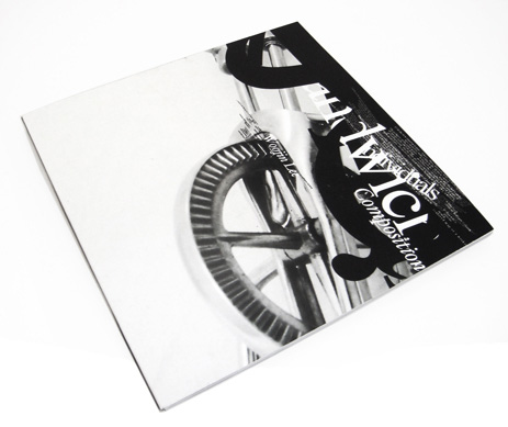
This book is a final assignment, and incorporates the steps taken in the process of composition exploration, while the book format functions as an introduction to the complexities of editorial design.
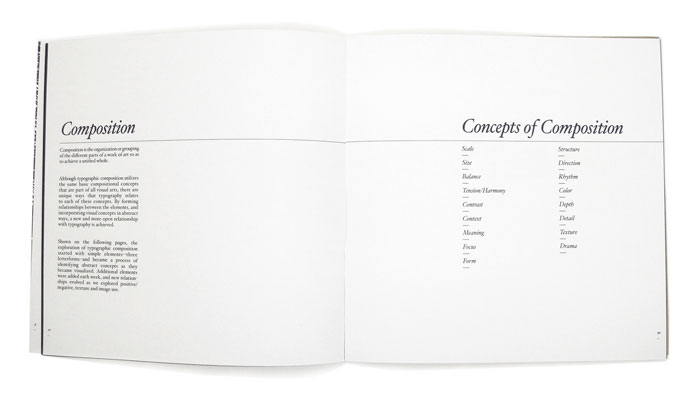
The first half of the book is a review of the technical requirements of typography. The second half is an exploration of the abstract compositional uses for typography, integrating hand skills and the computer as a way to render type. Historical and current forms of alphabetic communications were also explored, along with the relationship to modern image-based communications. Composition is the organization or grouping of the different parts of a work of art so as to achieve a unified whole. Forming relationships between the elements, and incorporating visual concepts in abstract ways, a new and more open relationship with typography is achieved.
Keeping the three letters from the previous assignment, I have now included three words. The words do not have to have any particular meaning or association with each other. Each letter and word is set in one of the following typefaces: Garamond, Times Roman, and Times Roman Italic. Using only the three letters and three words, I created the following compositions.
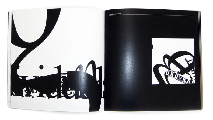
Positive/negative is the relationship between figure and ground.
Texture is the ability to render type in ways other than just hard edge black and white. Combining hand effects (drawing, painting), machined effects (photocopying, scanning), computer effects (PhotoShop, Illustrator) and/or accidental effects (spills, crumples, rips) allows to define type in unusual and unique ways-challenging and to see it differently.